UX Redesign for Intranet Dashboard
Client
American Academy in Rome
Year
2024
Summary
UX and information architecture redesign for the American Academy in Rome's internal intranet. Replaced an assumption-driven, institutionally organized structure with a task-based experience grounded in real user behavior.
Role: UX Researcher & Designer
Conducted user interviews and a card sorting exercise with twelve participants
Performed a heuristic evaluation of the legacy intranet
Defined a new, task-based information architecture and site map
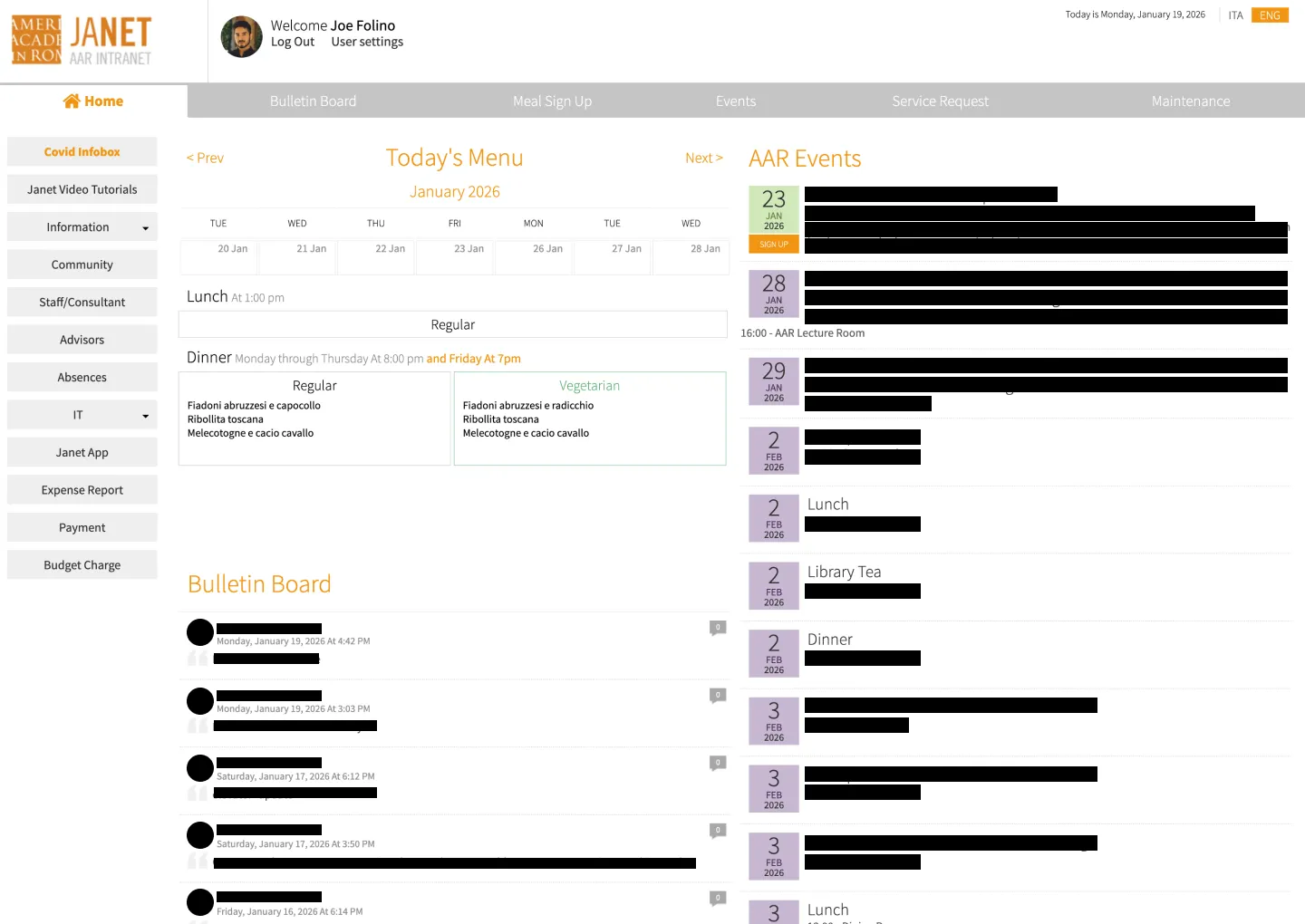
Designed a dashboard-inspired interface prioritizing high-frequency actions
Scope of Work
Software Tools

Context
The American Academy in Rome's intranet had grown around institutional categories rather than how staff and residents actually used it day to day, creating friction around the platform's two most common tasks.
Design Challenge
The legacy intranet reflected the priorities and assumptions of its original creators rather than the daily needs of its users. It treated informational depth and organizational structure as top priorities, while the two tasks users actually returned for, booking meals and checking daily happenings, were buried without clear visibility or hierarchy.
Key Responsibilities
I led the end-to-end research and redesign process: conducting user interviews and card sorting, running a heuristic evaluation of the existing system, defining a new task-based information architecture, and designing a dashboard-style interface to support the platform's highest-frequency actions.
Research Process
Research combined a heuristic evaluation of the legacy system with direct input from twelve users through interviews and card sorting, to replace assumption with evidence.
Problem Details
A heuristic evaluation of the legacy intranet surfaced several structural issues: poor visibility of key actions like meal sign-ups, cognitive overload from competing content types on the homepage, and a left-hand navigation that mirrored institutional categories rather than validated user mental models. High-frequency actions were visually treated the same as rarely used features, diluting their importance and forcing unnecessary scrolling for daily tasks. A follow-up card sorting exercise with twelve users confirmed the pattern: participants consistently grouped content by daily task rather than institutional ownership, clustering meal-related actions and payments together, and grouping events, announcements, and community updates into a single "what's happening" cluster. Informational content was rarely grouped as a primary destination, and users showed little interest in creating or sharing content themselves.
Why It Mattered
An intranet structured around organizational bias rather than actual behavior creates daily friction for the exact users it's meant to serve. When the two most common tasks, booking meals and checking community updates, aren't immediately visible, users are forced to parse irrelevant content just to complete a routine action. Validating structure through research rather than assumption meant the redesign could be built around what people actually needed, not what the organization assumed they needed.

Strategy
With research pointing clearly to two dominant use cases, the strategy centered on rebuilding the architecture around frequency of use rather than institutional hierarchy.
Opportunity
Rather than preserving a structure organized by department or content type, I identified an opportunity to rebuild the intranet around real usage rhythms: elevating meal sign-ups and daily happenings as primary, at-a-glance actions, while deprioritizing static informational content and consolidating low-value or redundant sections. This reframed the platform from an information-heavy resource to a task- and rhythm-driven tool suited to quick, repeat visits.
Goals
Elevate meal sign-ups and daily happenings as primary, immediately visible actions
Reduce cognitive load through a clearer visual hierarchy and modular homepage layout
Replace department-based navigation with task-based groupings validated by user research
Support fast passive consumption while keeping key actions accessible without deep navigation
Deprioritize or merge redundant, low-value sections to reduce noise
Build a scalable site map aligned to real usage patterns rather than organizational structure

Solution
The redesigned intranet elevates meal sign-ups and community updates as primary, at-a-glance actions, directly addressing the two reasons users return to the platform most. A dashboard-inspired layout reduces the cognitive load created by the legacy homepage's competing content types, while a new task-based navigation model, validated through card sorting, replaces the department-driven structure that previously mirrored institutional bias rather than user mental models. The new site map consolidates secondary content and establishes a scalable hierarchy suited to daily, repeat use. The result is a platform that supports fast decision-making for high-frequency tasks while still accommodating passive consumption, replacing an assumption-driven tool with one grounded in validated user behavior.


